Digital advertising and marketing: only the best ideas worldwide, since 2003
Tag archives: e71
Nokia’s Beautiful Connections
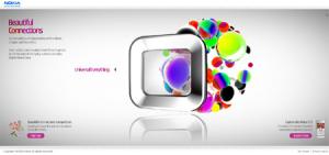
In the UK Nokia is online with a new website to present its E71 model. Wieden + Kennedy and Hi-res! are the agencies which commissioned four films to bring to life the concept of “Beautiful Connections” that characterizes the phone.
The result is a website made of four very beautiful videos and not much else. What I mean by this is that weirdly enough, the information about the mobile phone is almost non existent on the site. You get only two images of its design and that’s it. I have contrasting feelings about marketing initiatives that mix art and advertising. As usual I have a very pragmatic approach, and I appreciate and understand them only when the brand and the product fit the artwork. In Nokia’s case the video do a nice job in visualizing the idea of beautiful connections, but the website lacks the step further not connecting the phone with the same idea. What do you think? Am I too radical in my opinion? Or am I too conservative thinking that adding technical information about the phone will banalize the experience?
Popular posts
Tags
adidas advergame advergames advertainment advertising ambient marketing australia belgium best brazil coca-cola email marketing facebook fashion france germany google heineken ikea infographic italy japan marketing mobile content mobile marketing msn nike nokia online ads online advertising online campaign online marketing print advertising rich media samsung sms spain sweden tvc twitter uk video of the day viral marketing volkswagen wieden + kennedy
