Digital advertising and marketing: only the best ideas worldwide, since 2003
Tag archives: fashion
Just another day at the office for J-Lo
When thinking about Jennifer Lopez, seeing her going to the office is not the first that comes up. But she does, and with success. Although for J-lo, going to the office just like anyone else is not as easy as it sounds.
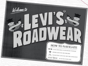
Levi’s Roadwear, maps & denim
BBH Asia Pacific has created an interesting website for Levi’s. Using Google Maps they turned denims into continents you can navigate. Moving from city to city you can discover a beautiful illustration overlaying the collection and unveil nonsense stories of a fictional (?) rock band. Read more…
Great guerrilla at Amsterdam Fashion Week
Zeeman, a famous cheap clothing retailer from Holland, wanted to prove that looking good doesn’t have to be expensive. They chose the Amsterdam International Fashion Week as their ultimate stage to tell their story. The guerrilla stunt worked.
Fashion brands falling in love with Instagram
TNW had a great article a few days ago on the brands that are moving the first steps on Instagram. If I remember correctly Levi’s Brazil has been among the first early this year, when they started presenting their collection to the Instagram community. Read more…
Converse, The Canvas Experiment
Last year we saw Nike playing with the shoes to generate music. Today we have Converse using music to animate shoes patterns. Artists have been invited to play their instruments to “animate” a giant 4×5 meters equalizer made using 480 pairs of Chuck Taylors. The result is pretty cool.
High end fashion loves (short) movies
It has become kind of trendy for the fashion industry to work with famous directors and movie makers to present the new collections. Prada and YSL are just the latest high end fashion brands that decided to go this way. It’s a strategy I don’t fully get as I miss a more integrated communication approach but I presume the “short movie” solution is paying back in terms of PR and possibly does a good job in filling the TV sets within the showrooms with content that goes beyond the usual catwalk. Prada has worked with Chinese filmaker Yang Fudong to represent the new direction in its visual communication through a black & white journey in Shanghai during the 30s & 40s.
Fashion for dogs and ecommerce dogs (owners)
From Japan another great example of digital communication and a clear demonstration that the online media and online commerce are (more than) ready to support any brand or product (if the communication is done in the right way). Today we talk about dogs, fashion and ecommerce. The brand is called Free Stitch and produces clothing for small dogs. I personally hate the idea of putting a ridiculous cloth on my dog but I appreciate small dogs might suffer cold… and this website would definitely push me to buy something fashionable.
The experience is brilliant, with a gallery of “models” wearing the different items and the absolutely fantastic possibility to browse the collection by clothing or by “dog”.
H&M Fashion Studio
H&M is online with a new website to launch its Fall/Winter collection. Once again they do simple neat things that work very well to present a wide range of items while keeping the experience at least a bit inspirational.
The images of the offline campaign are slightly animated in a Fall mood with blowing wind and falling leaves. Not really exciting, but definitely better than simple static shots. Each outfit comes with three buttons: one for sharing it with the world on a blog, one for commenting on Facebook (once again a smooth simple integration) and one to further explore the styling combination connected to that look.
Filippa K: what inspires you?
Filippa K has launched a very nice website to present its Fall09 collection. The navigation begins in a rather cold way, with a tag cloud which asks the visitors from what they get inspiration from. Once the choice is made the experience becomes more interesting and most of all (and fortunately) warmer.
Each shot of the collection is presented with an hotspot that, when clicked, activates a further level of exploration, either a video piece or a text that provides further information on the product, the style or the fabric.
The new Wrangler isn’t new
Wrangler Europe is online with a new website to promote its Fall/Winter collection. Having worked on denim websites myself, I know I have a very critic approach to these kind of projects. To be honest, I like the idea of a video (catwalk style) presentation, but I miss a deeper level of content to find out more about the product.
I believe the use of video for denim presentation should be considered mandatory from now on. It should really represent the starting point, not the end of a street/fashion project.The Wrangler website looks nice, but also rather flat if you think about some other denim brands digital experiences launched in the last year or so.
Popular posts
Tags
adidas advergame advergames advertainment advertising ambient marketing australia belgium best brazil coca-cola email marketing facebook fashion france germany google heineken ikea infographic italy japan marketing mobile content mobile marketing msn nike nokia online ads online advertising online campaign online marketing print advertising rich media samsung sms spain sweden tvc twitter uk video of the day viral marketing volkswagen wieden + kennedy


