Digital advertising and marketing: only the best ideas worldwide, since 2003
Tag archives: fashion
Uniqlo Polo Now
From Japan, a new interesting project by Uniqlo. How to make a polo collection cool just playing with some good photos and a great sound design. And e-commerce store, as usual, is just one click away.
Lacoste gets cool
Strange but true, Lacoste is becoming (or coming back) as a cool brand, at least online, and/or at least for its latest website. The campaign was shot by Terry Richardson, and this is already a good start.
The website visuals look very familiar to me, with a strong mix of white, red and green. I like the way the collection is presented. I like the weird messages all around the screen. I like the music in the transitions among sections. I just don’t like the advergame, it looks like it has been forced into the site. It simply doesn’t fit.
The dancing t-shirts
An infinite number of animated t-shirts populates the summer collection of Japanese fashion brand Sunny Clouds. The website is pretty basic but also quite fresh in presenting the product and driving immediate sales.
The animations with the t-shirt definitely buy the products some attention, and even the product catalogue shots become interesting in a context that communicates a feeling of joy and makes you feel Spring is almost here.
Home shopping according to H&M
H&M has launched a new section of its ecommerce website to promote and sell its home collection. It’s a pretty basic website, but it still represent a good reference as it contains all the elements that contribute to a positive online shopping experience.
First of all the website features beautiful high-quality photographs. But the real added value in the product presentation is represented but the fact that all the items are put into context. You don’t simply browse a series of tableclothes, dishclothes and pillows but you actually see how they will look like in an ideal kitchen or living room.
New look for K-Swiss
K-Swiss has refreshed the look of its Kspace website with the help of Perfect Fools. The website combines beautiful shots of K-Swiss’ testimonials with video interviews where they explain their own style on and off the tennis court.
The mood is very classy with a black & white look and feel that positions the brand as classic yet cool (and even sexy) choice in footwear. A quite different approach after last year’s free running campaign.
Fiat 500 by Diesel
Christmas is coming, and you might want to offer something special to your relatives or friends, but of course going shopping in the crowded shops is a chore. Why not getting the limited edition of the Fiat 500 by Diesel ? Only 10,000 units of this car designed by Fiat and the fashion label Diesel, are being made available worldwide. You can configure and order it exclusively on the English website here.
This cool e-marketing association would have certainly deserved more content and online materials. Nevertheless, I suggest we launch a subscription to offer one to Martina !
It’s Closed, but it’s great
I’m becoming a big fan of full screen websites. Not always, not for all brands, but in cases like the Closed one, I think the full screen mode really makes the difference to deliver a great user experience.
Especially when it comes to fashion brands, to be able to exploit the whole screen, without the functional but ugly browser buttons, allows you to establish a cleaner, more immersive, visual relationship with the user.
Levi’s Mix it Up
I’m (positively) impressed by the number of interactive project Levi’s is launching to push its Spring Summer Collection. After Copper Waste and Cut to Reveal You it’s time for Mix It Up coming once again from Asia/Pacific.
The Ecco endless walk
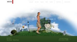
I feel bad for not being able to blog as often as I would (and should) but spring is an extremely busy period at work, so I just hope you will excuse me… To get back on track, I start with a Polish website I found through The FWA. It’s the Ecco World, an endless walk around the globe to discover the spring summer collection of the brand.
It’s a lovely and innovative experience… maybe the shoes are not that nice, but the navigation makes the difference to appreciate the products.
The agency behind the site is Click5 who has been so kind to share also a video with the “making-of”.
Text your worst ever fashion mistake and win with Nivea
With the support of MindMatics and Cognito, Nivea has launched a mobile marketing campaign offering customers the chance to win £1,000 cash to spend on a spree with celebrity stylist Hannah Sandling. Entrants are asked to text in their worst ever fashion mistake to a designated shortcode along with the word “Pure” – for example “Pure - Shell Suit” or “Pure -Puff Ball Skirt”. Their number is then entered into a prize-draw to win the £1,000. Designed to support the launch of Nivea’s new Pure deodorant range, the mobile campaign is the first step in establishing a dialogue with consumers. The competition is being promoted through leaflet hand outs at events and a UK media advertising campaign.
Popular posts
Tags
adidas advergame advergames advertainment advertising ambient marketing australia belgium best brazil coca-cola email marketing facebook fashion france germany google heineken ikea infographic italy japan marketing mobile content mobile marketing msn nike nokia online ads online advertising online campaign online marketing print advertising rich media samsung sms spain sweden tvc twitter uk video of the day viral marketing volkswagen wieden + kennedy


