Digital advertising and marketing: only the best ideas worldwide, since 2003
Tag archives: germany
Nature misses you
We Miss You is a cool social campaign from three German film students. It deals with the relationship between humans and nature by asking an exceptional question: “What if nature cares for us or even misses us?” The online short film is intruiging and has a clear message: nature misses you.
Remember the Wall
It’s kind of scary to realize that 20 years have already passed since the fall of the Berlin Wall. 1989, looks like yesterday. I hope you haven’t forgotten those days but if this is the case or if at the time you were too young or not even born I strongly suggest you to visit an educational website launched in Germany by the newspaper Berliner Morgenpost.
The website features a lot of content to remind us of an event that changed the history of the contemporary world. Photographs, videos, interactive animations explain us the end of the Cold War and the changes that have taken place in Berlin during the last 20 years.
The smallest advergame ever
German agency Jung von Matt has joined forces with French web developer Mathieu ‘P01′ HENRI to produce the smallest advergame ever. It sits in 16*16 pixels or, better, in a favicon. The progject has been conceived to promote a very small car: the Smart fortwo.
As you can see from the video, banners have been placed on automotive sites to invite people to play. The idea is fun and definitely very creative even if I’m not sure how many people visiting those websites have really appreciated it. Would be interesting to know not only the buzz the advergame will be able to create in the blogosphere, but also the numbers in terms of clickthrough (for example) it generate. via The Ispiration Room
Can you park a MINI Baby Racer?
From Germany an amusing advergame created by Interone for MINI. It’s called Power Slide Parking and it challenges users to push a friend on a MINI Baby Racer right in a parking place.
It’s difficult and engaging enough to make you play at least a couple of times while keeping an eye on the collection of MINI cars parked along the street.
It’s Closed, but it’s great
I’m becoming a big fan of full screen websites. Not always, not for all brands, but in cases like the Closed one, I think the full screen mode really makes the difference to deliver a great user experience.
Especially when it comes to fashion brands, to be able to exploit the whole screen, without the functional but ugly browser buttons, allows you to establish a cleaner, more immersive, visual relationship with the user.
Ikea, Wait until September
The Big Brother meets Ikea, but it has been done before. Warte bis September (Wait until September) is a website that streams 24h a day Nils, a young German who lives in an empty home waiting for the new Ikea catalog to be released in September. think iIt launched yesterday and, obviously, it will stay online until the catalog is out.
You can watch Jens living his daily life in his living room, meeting friends, playing videogames and, most of all, taking calls from those who watch him on the Web. This is his phone number if you want to give it a try: +49 40 22 61 11 61.
Discover the Scirocco reliquary
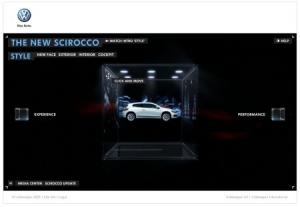
Needless to say, in Germany they know who to build great cars, and how to build websites that present cars in the right way. The latest work we are talking about is by Tribal DDB Hamburg, that created an online experience for the new Scirocco by Volkswagen.
There is a lot of content to explore starting from the chrystal box where the car is kept that looks like a reliquary. Users have two options for the navigation, they can either follow the storytelling in video to get an overview of the car (style, performance and experience), or they can decide to find out all the details going through a good amount of text and videos.
Absolut black & white
After the Absolut Colors campaign I posted about a few weeks ago, now it’s time for a gloomy yet psychedelic yet cool Absolut 100 video recently launched in Germany.
NoMoreSleep and Timo Boese from Lowerground are behind it. via
Volkswagen future vision
In Germany Volkswagen has launched a futuristic website to explain its eco-friendly approach to car-engineering. Everything is in German, but the site is visual enough to allow you having a good overview of the project even if you don’t speak the language.
At first sight everything looks very nice and well designed. However if you spend one more minute on the site you realize there is no interactivity (if it’s there I wasn’t able to find it), it’s just storytelling or, better, brand preaching about what they do or will do to produce eco-friendly cars. In my opinion it’s a lost occasion, their online project is a good idea, but it’s a pity they missed the chance to build a minimum connection with the public. What do you think? The agency is ArgonautenG2.
Move, don’t get fat
From Germany, a lovely campaign created by Scholz & Friends, Hamburg for the German Olympic Sport Federation. You’ll better do a lot of sports… Copy says: “If you don’t move, you get fat”.
Popular posts
Tags
adidas advergame advergames advertainment advertising ambient marketing australia belgium best brazil coca-cola email marketing facebook fashion france germany google heineken ikea infographic italy japan marketing mobile content mobile marketing msn nike nokia online ads online advertising online campaign online marketing print advertising rich media samsung sms spain sweden tvc twitter uk video of the day viral marketing volkswagen wieden + kennedy


