Digital advertising and marketing: only the best ideas worldwide, since 2003
Tag archives: italy
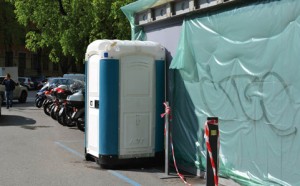
IKEA’s surprise chemical toilet
Usually public toilets, and chemical toilets in particular, never reserve nice surprises. You get in, and you try to get out as soon as possible. But the story of this chemical toilet installed in Milan during the recent Design Week is different. It’s an IKEA toilet or, better, it’s a gateway to the IKEA world. Check out this fantastic ambient marketing idea to promote IKEA’s bathrooms line. Read more…
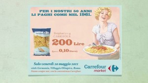
Carrefour’s Back to ’61
History repeats itself, but now for a good reason. Carrefour Italy was dealing with how to celebrate their 50th anniversary in the middle of a huge economic crisis in the country. The solution? Bring everything back (prices, product labels, etc.) to 1961, the time of the economic boom:
(via Juan Boronat)
Share your stress and win an award
If you’re stressed and you do weird things during office hours (see video below), you probably need an holiday… Check the “My Stress Awards” website, share your oddities and earn the chance to win a few days off in Valle D’Aosta, a region where it’s possible to ski, relax and enjoy nature forgetting about the stress of the daily life. Created by Saatchi & Saatchi the campaign promotes tourism to Valle D’Aosta with two videos uploaded on Youtube (this is the other one) and an online contest. Overall the concept of the campaign is pretty good and original, the videos might look very rough and slightly too long, but in the end they result amusing and kind of real and, most of all, they deliver the message.
Dexter, the creepy (advergame)
If you’re looking for something creepy in a rainy Wednesday afternoon, check out the advergame launched by Fox to promote the Italian debut of Dexter. For those of you based in Italy, there’s also a contest to join. The prize are cool: for example, a trip to Miami for 2, or a knives set (!!??!!). However in order to win you “have to” watch Dexter’s episodes and be able to explain what happens. I’m not brave enough to do it… The agency is Ola.
Horror in Italian interactive
This is not a nice post. Once again I have to sadly point out how it’s rare and unusual in Italy to find innovative ideas in interactive. This morning I was reading Pubblicità Italia, and I found the news about this campaign (sorry the article it’s in Italian), www.bodyscare.com a website created to promote the upcoming horror movie “Hostel II”. I visited it and I thought “cool, eventually an innovative concept! But it was just an illusion… Yes, because when you first land on the site you happen to see a L’Oreal kind of visual, promoting a beauty farm and a series of treatments to keep you beauty and young. However the positive impression lasts just for a couple of seconds, because after a moment the site reloads and because the ugly page I show below. So, to recap… they had a very good idea (hiding an horrow movie campaign behind a beauty farm site), but they didn’t take it any single step further. There isn’t a second level of content (and there was sooo much to play with!), everything is just a wallpaper! Flat, sad and depressing. Who’s the one to blame for this lack of energy? The client? The agency?
Ikea’s twins
Eventually a nice campaign “made in Italy” to share. The site is called “Operazione Gemellaggio” (which translates into something like “Operation Twinning”) and it has been created by Profero to support the opening of a new IKEA store in Milan. The idea is that the 18 years old store located Carugate now has a “twin” in Corsico, and to celebrate the event they’ve launched a competition based around user generated content (of course Users are invited to upload their photo and match it with their favourite Ikea’s product. A very simple concept that is generating a lot of interest and over 1000 submission is just a few days. Those who participate can win Ikea’s vouchers and will see their photo in the Milano’s stores. Five seconds of fame… it’s now banal, but it still works so… why not?
It’s Christmas, get a job
In Italy, jobs site Monster has launched an online postcard to wish his visitors Merry Christmas. Maybe it’s not really a Christmas related postcard, but it’s still a nice idea, which could work quite well in Italy, generating some viral effect. Turn your speakers on, and then click on the monuments on the map, you will be invited in local dialect to get a job… soon!
Bread is life
Lorenzo Marini&Associati for BICE (Italy). Bronze FigLeaf winner at the Lisbon Erotic Advertising festival 2002.
BMW Italy: new campaign, old mistakes
In Italy BMW, is presenting its Serie 3 with a Tv spot directed by Spike Lee (D’Adda, Lorenzini, Vigorelli, BBDO is the agency) and an online campaign which takes advantage of (rather intrusive) video ads. The video ads present exactly the same spot aired on TV, which is a nice spot, but is not really the kind of ad you’d like to watch online. The second disappointment is when you click on the banner: you are taken to the BMW Serie 3 website where your only option is to register in order to access the content. I’ve tried to fill the form, but there are just too many personal info you need to provide, I got annoyed and preferred to leave. I wonder how many people actually registered without even knowing the kind of content they will be getting…
Ferrero and the kids’ online paradise
Pubblicità Italia reports Kinder and Ferrero snacks brands have launched an advertainment website targeting 4 to 12 years old kids. The site is called Animotosi and is built around the ideas of fun and movement. Advergames, e-cards, personalised cartoons create an attractive environment for young web surfers. The only thing I don’t really like is that there is also a mobile goodies section, where kids can download ringtones and logos. Even though I understand in Italy we have very young boys and girls owning a mobile phone, I’m not sure it’s very ethical to offer them such kind of content. Let’s be honest, 99 percent of the times kids don’t need a mobile phone, so why should we make them desire something completely unnecessary? Am I too radical in my views?
Popular posts
Tags
adidas advergame advergames advertainment advertising ambient marketing australia belgium best brazil coca-cola email marketing facebook fashion france germany google heineken ikea infographic italy japan marketing mobile content mobile marketing msn nike nokia online ads online advertising online campaign online marketing print advertising rich media samsung sms spain sweden tvc twitter uk video of the day viral marketing volkswagen wieden + kennedy

