Digital advertising and marketing: only the best ideas worldwide, since 2003
Tag archives: japan
Suzuki, the family car
Palette, the new car by Suzuki, is really ugly, but the Japanese site to present it is really nice (and weird). It’s something between Mary Poppins and Charlie Chaplin, with animations and a story telling sweet and definitely unusual.
As usual, I don’t speak Japanese, so I don’t understand a word, but I like to point out the different communication approach chosen by Suzuki to present its new family car. I can imagine kids sitting at the PC with their parents browsing through the site to discover the animated stories.
Axe Full Moon Party
From Japan, a new chapter in the Axe saga. It’s now time for the Axe Full Moon Party, with a sexy Thunderbird look-alike trying to seduce the girls on the beach.
Once again, given the language gap, I’m not able to tell you much about the campaign… As usual, it would be great if someone who speaks Japanese could leave a comment to explain what is going on. The whole thing looks quite weird and different, therefore it’s very appealing for us curious interactive marketers.
I like the fact that this campaign doesn’t present an ideal beauty, showing beautiful models and a sexy boy. Instead, you have puppets whose sex appeal is of course granted by the fragrance.
Adidas Celebrates Originality. Or maybe not…
Onitsuka Tiger made them OF Japan, Adidas made them FOR Japan. There is a subtle difference in the copy (and maybe even in the concepts) of the two footwear brands presenting their collections to the Asian and International market.
It makes me smile a bit the idea that the second comer, Adidas, celebrates its originality with a campaign that, in my opinion, is not very original. However, if we pass over this “detail”, we can get some food for thought (aka inspiration) out of the Japanese Celebrate Originality website.
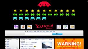
Space Invasion on Yahoo!
To celebrate the 30th anniversary of Space Invaders, Taito has invaded Yahoo! Japan for one day (on April 1st). The page was extremely well done, and fortunately is still available here.
From a media point of view, I like the “domination” of a portal’s homepage for a day. No doubt it might result quite intrusive, but I think it offers great opportunities of creating something really outstanding and engaging. The goal must be to create an experience for the user, not just a bigger, enhanced version of a banner. And this, of course, takes time to develop, and definitely a different approach to online advertising. via Imprint TALK.
The Run Revolution
From Japan, by Wieden + Kennedy Tokio, the latest Nike ad for Nike+. Ideal for runners looking for inspiration in spring.
100 tips to find a new job
If you’re looking for a new job, and you can speak Japanese, you should definitely have a look at the 100 Cheer Girl project launched by Soft Bank Human Capital in Japan. The idea is quite simple, 100 girls share with you tips to to succeed in your career. The interface in Flash is bright and amusing, while the videos are weird and quite sexy… well, the sex sells idea applies also to recruitment companies…
Run, Miss Piggy, run!
A mobile phone that can keep track of the calories you burn when you do sports is original (and weird). What is even more weird is the mini-site Casio has launched to support his cutting edge W61CA model.
In this lovely advergame you are a “piggy trainer”. You have to help a young Miss Piggy finding a boyfriend. She has to run and loose weight with your support. Can you make it? Don’t worry if everything is in Japanese, you can find your way through the game. via The FWA.
Converse says Thank you!
To celebrate its 100th anniversary Converse has launched in Japan a “Thank you” project, to thanks its loyal customers and to involve them in a collaborative project to further promote its famous shoe model.
But let’s go into the details of the campaign, thanks to David’s post on Culture Buzz… Basically Converse asks the users to become their advertising agency, and to carry out a series of actions to promote the brand. The better (and the more) they promote Converse, the more points they earn, points that can later be exchanged with products.
Interactive baseball the Japanese way
As it usually happens when I post about Japanese websites, I have no idea of the reason why they did it, I guess just for self-promotion, considering that the only brand name on the site is the one of the agency (Bascule, the same that did Axe Busters some time ago).
Is it an advergame? Probably… For sure it’s a weird visual experience about baseball, with a good art direction and remarkable usability, a characteristic that makes it quite easy to find the way around and play.
Lupin is back and online!
In Japan Lupin is still alive and kicky as in the Seventies. I’ve just discovered this site www.lupin-steal.com that I don’t understand as it’s in Japanese (once again it would be great if Shingo or someone else could explain me/us what the site is about but I still found great, not only because it reminded me of the hours spent watching Japanese cartoons in the Tv when I was young(er).
I clicked all around, enjoying the bits and pieces of the cartoon I used to love and discovering a page with a game…
Popular posts
Tags
adidas advergame advergames advertainment advertising ambient marketing australia belgium best brazil coca-cola email marketing facebook fashion france germany google heineken ikea infographic italy japan marketing mobile content mobile marketing msn nike nokia online ads online advertising online campaign online marketing print advertising rich media samsung sms spain sweden tvc twitter uk video of the day viral marketing volkswagen wieden + kennedy


