Digital advertising and marketing: only the best ideas worldwide, since 2003
Tag archives: netherlands
Move away from Page 23
At first sight it might look like an IKEA commercial. Instead, Page 23 is a beautiful 4 minutes short movie that describes a surreal yet real world many of us might live in. I like the photography but most of all the message that I read in the film. I might be wrong but I love the way it challenges us to look beyond our homes and our lives that are often shaped by products and advertising. Everything looks beautiful and perfect. But in the end we look all the same. Faking the reality and hiding from our own reality. Appearances can be deceptive. And advertising masters this art.
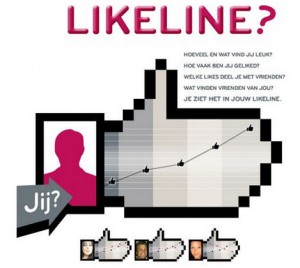
LG Likeline
LG has developed a Facebook application that enables users to create a visual overview of their Like-history and show exactly what the user is like and what he or she likes. The application also lets people find Like-Minded peers.
Banned Hyundai Ad
This commercial was meant to air on Dutch television, but was not approved by the Hyundai board. Supposedly it was then allowed to run as a ‘web only’ ad. It’s pretty funny and a little scary. Nice execution from an unusual insight. Read more…
Kitchen generated content
In The Netherlands, IKEA has launched a nice online campaign to promote its kitchens and drive loyalty as well as new customer acquisitions.
Those who bought an IKEA kitchen are invited to share their setup and help building a “virtual” but “real” kitchens gallery. But you don’t contribute just for the sake of or, better, to show off your home (which might be already a strong reason to participate for Dutch people who are usually very proud of their interior designs). If you decide to share your kitchen in the gallery you can actually win the chance to get your money back on your purchase
Beware of the false Vladimir
In The Netherlands Symantec has launched an infotainment website to explain users the risks of using the Internet and the its solutions to avoid problems with digital assets and sensitive data. You never know who’s watching you when you are online, the “false” Vladimir might be there ready to steal your credit card number…
The project reminds of a similar initiative launched last year in New Zealand. Probably the execution is not as good, but the website still does a good job in explaining the risks to a target that is not very aware nor familiar with them.
A Tom Tom is forever
This Christmas Tom Tom is trying to replace diamonds as the best gift to state your partner your love forever. From The Netherlands Black Magic Marker shares with us an amusing campaign were men promise neverending love to their girlfriends if they get them a Tom Tom for Xmas…
The message to the beloved person can be personalized by uploading a photo of the couple and images from an holiday in which you lost the way while travelling with your partner.
Volkswagen Clever Innovations
If you’re looking for a lesson in creative digital marketing, you should have a look at the latest website created by Achtung! for Volkswagen. It’s called Volkswagen Clever Innovations and it clearly shows how Flash and video can be cleverly used to develop premium online experiences with the product.
On the website, you are taken through five typical dangerous or simply complicated situations you might face while driving. For each case, Volkswagen has developed a technology that can help you overcoming the difficulty, and it makes you discover the feature in a smart, interactive way.
Wall-E pops!
Wall-E will debut at the end of the month in The Netherlands, and to promote it Disney & Pixar have launched a local version of the movie website working together with Jongenlui.
The site isn’t particularly cool as it looks like an old good and flat JPG, however the advergames section makes the difference with four very nicely developed games. In particular, have a look at the addictive “pop-up game”. via.
The Luchtmacht Experience
Armies around the world are taking online recruitment very seriously, even more than brands I would say. The latest example I’d like to share with you comes from The Netherlands, where the Luchtmacht has recently launched an online experience to unveil its world to the young Dutch.
The website is absolutely amazing. I can’t say whether it really depicts the reality of the Dutch Airforce, but I know that if their goal was to impress young users, the results is surely impressive, at least from a Flash/design point of view.
Lipton, Green but not that Clear
It takes some patience and quite some imagination to understand the metaphors in the Lipton Clear Green site recently launched in The Netherlands.
The site is very nicely done, but it’s not so intuitive (at least for me to get the connection between the chaotic daily life and the Lipton refreshment. I give you a hint… it’s all about pullng the bottle on the left side of the screen…
Popular posts
Tags
adidas advergame advergames advertainment advertising ambient marketing australia belgium best brazil coca-cola email marketing facebook fashion france germany google heineken ikea infographic italy japan marketing mobile content mobile marketing msn nike nokia online ads online advertising online campaign online marketing print advertising rich media samsung sms spain sweden tvc twitter uk video of the day viral marketing volkswagen wieden + kennedy


