Digital advertising and marketing: only the best ideas worldwide, since 2003
Tag archives: nokia
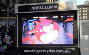
Nokia kicks some Angry Birds’ butt
Ever felt like giving those ‘Angry Birds’ a good kicking? Nokia’s line of ‘Amazing Everyday’ and their smartphone Lumia were recently promoted with an Augmented Reality Angry Birds Installation in Sydney where you could do just that. Read more…
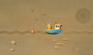
Nokia N8 - Gulp
After scoring big with the smallest animation ever shot (Dot), the Nokia N8 campaign returns with the largest stop motion set ever built. Their world record attempt called Gulp was shot on a real Nokia N8 and is the beautiful story of a fisherman being gobbled up by a monstrous fish - and luckily being spat out again. The whole endeavor is pretty massive. Read more…
Pink is the new Gold for Nokia
Maybe a Barbie who looks like Lady Gaga can still help making a Nokia phone cool… Jokes apart, this TVC by Wieden + Kennedy London for the new Nokia N8 is pretty good. Read more…
Agencies and the art of storytelling
Posting cool stuff on Adverblog is getting more and more difficult. I mean, I think the time of cool microsites is almost over. I was discussing the topic with some friends in Amsterdam the other day. To be successful and to be meaningful, you need to do more than a website. You need to connect it with the offline world, and surely you need to create a story worth being noticed and shared through social media. Paid media is no longer enough to drive traffic. And, in the same way a good/creative website doesn’t make a campaign successful if you don’t build an integrated action around it. So, getting back to the point, to become a cool campaign we can write about, you need to tell us a story that goes beyond sharing a link.
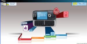
Nokia colorful emails
Nowadays to create an original, creative website to present a mobile phone is a hell of a challenge. We’ve seen (almost) everything. Like in the case of the automotive industry creativity seems to be the hardest word. Competition is fierce, differentiation is weak, money isn’t always there. So what should an agency do to introduce a new Nokia mobile phone which wants to challenge the Blackberry?
Try, for example, with a colorful and engaging interface. Then create a video which uses pictograms a smart way. Shake everything together and then add a tiny smart widget that give a touch of originality to your emails. Visit the new Nokia E75 website to experience all of this.
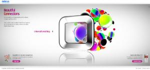
Nokia’s Beautiful Connections
In the UK Nokia is online with a new website to present its E71 model. Wieden + Kennedy and Hi-res! are the agencies which commissioned four films to bring to life the concept of “Beautiful Connections” that characterizes the phone.
The result is a website made of four very beautiful videos and not much else. What I mean by this is that weirdly enough, the information about the mobile phone is almost non existent on the site. You get only two images of its design and that’s it. I have contrasting feelings about marketing initiatives that mix art and advertising. As usual I have a very pragmatic approach, and I appreciate and understand them only when the brand and the product fit the artwork. In Nokia’s case the video do a nice job in visualizing the idea of beautiful connections, but the website lacks the step further not connecting the phone with the same idea. What do you think? Am I too radical in my opinion? Or am I too conservative thinking that adding technical information about the phone will banalize the experience?
Mobiles of the others
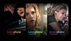
Back after a long break, I really don’t know where to start from… There are so many projects I should catch up with! So bear with me if I will post about something that is a few weeks old. If it’s good, it’s worth keeping track of it anyway. Let’s start with this website for mobile obsessed launched by Nokia to promote its 7610 model. I can’t help dubbing the site the “mobiles of the others”, because it is all mobile voyeurism.
Confess it, how many times have you looked (or wished to look) at your partner or friend’s mobile phone to discover some segret or simply because you are damn curious??? Well, on Somebody Else’s Phone, your wish become real, as you can “spy” the life of three young characters by viewing content within their Nokia handsets.
Nokia Music Almighty (monsters)
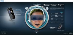
WK London and Firstborn have created a scary monsters generator for Nokia. As part of the Music Almighty campaign, the site allows visitors to pick their favourite music genre and then transform themselves in one of the weird characters called Electro Blipper, Table Turnin’ Hopper, Animal Rocker, Pink Popper and Philarmaniac.
You can upload your own photo, play with the control levers and… become someone (or something) weird. For example, you can admire me in an Electro Blipper version… More or less it’s a revised (not necessarily) improved version of Elf Yourself, but the music tracks are pretty cool, and the illustration of the print campaign were beautiful, so we can excuse the lack of originality. Actually, once you’ve created your avatar you can also rap a song and upload it as well, to finish the creation of your virtual singing Frankenstein. But it takes time and, most of all, motivation. via
Nokia: exclusivity for charity
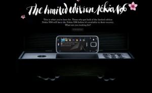
Nokia has recently launched an interesting project that mixes charity and exclusivity. “Face the task” allows consumers to put their hands on an exclusive limited edition version of the Nokia N96 one month before the phone hits the market. There are two ways to get it: either by taking part to a quiz and then entering a draw, or directly paying an amount of 759 Euros that will directly go into the dedicated WWF account for the Red Panda conservation.
The site in itself is simple, nice and strongly video based (the agency should be Farfar). Each of the phone characteristic is told by the actions of a ninja woman in a series of videos that very much reminds of Ang Lee’s Crouching Tiger, Hidden Dragon. When you go full screen the experience gets really immersive, even if the mix of ninjas and technology may result a bit weird.
Nokia 3110 Evolve(s)
Nokia has recently launched a website to present its environmentally friendly phone, the 3110. The site doesn’t tell much about the technical features of the phone, rather it focuses on the ecological aspects of the project, with a series of interests to Nokia and WWF people.
At first sight (and also at second sight), the website hasn’t got anything special. The navigation interface, in particular, is a bit “disconnected” and could be very much improved. However I appreciated the enrichment of the interviews with simple yet nicely done animations that reinforce the story telling and help the viewer to keep paying attention to what the testimonials say.
I believe the agency behind all this is Wieden + Kennedy.
Popular posts
Tags
adidas advergame advergames advertainment advertising ambient marketing australia belgium best brazil coca-cola email marketing facebook fashion france germany google heineken ikea infographic italy japan marketing mobile content mobile marketing msn nike nokia online ads online advertising online campaign online marketing print advertising rich media samsung sms spain sweden tvc twitter uk video of the day viral marketing volkswagen wieden + kennedy
