Digital advertising and marketing: only the best ideas worldwide, since 2003
Tag archives: print advertising
Phones down, bottoms up
What I like about this ad is that it doesn’t need a lot of explaining. Great art direction and a clever line “Enjoy responsibly. Phones down, please.” Read more…
The Transformable Press Ad
Transformers toys have the ability to transform themselves and become something else to adapt to the situation. For example, they can become a car or a fighter jet. And now also a transformable print ad. It’s a simple, apparently obvious, surely very smart idea by DDB Paris, who worked with paper artist Bertrand Le Pautremat to create the first print advertisement that using the origami technique can turn the magazine page into a robot ready for battle. Read more…
6 things you can miss while reading a newspaper
Nice and smart experiment by Duval Guillaume to prove that newspapers still have their reason to exist. On behalf of Newspaperswork, the marketing platform for all Belgian newspaper publishers, they gave three top advertisers a free ride in a chauffeur-driven car. This way the three executives would have the time to read the newspaper on their way to work. No matter how hard the agency tried, seems like there was no way to distract them. Read more…
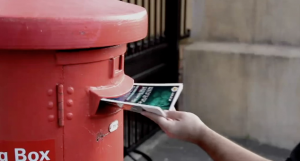
VW turns post box into recycling bin
The challenge to advertising any eco-friendly product or service is to make sure that the ad itself upholds the values behind the product.  Instead of creating a print ad about VW’s BlueMotion range of eco-friendly cars, Ogilvy Cape Town used the advertising production budget to pay for postage and created an insert that allowed anyone to post the magazine (once no longer needed) to a recycling plant.
Print ads with sound
I realized we have become 99% digital communication geeks, and we have become a bit too picky, not really posting about print advertising anymore. This is kind of silly, I have to admit. Great ideas are great ideas. And great digital campaigns are not necessarily better than great campaigns for traditional media like print or outdoor. These three ads by Ogilvy Thailand made me realize we should not be “racist” with creativity. If it’s not founded on a good (possibly original) idea, advertising is garbage, regardless of the media. Print advertising is alive. And fights with us.
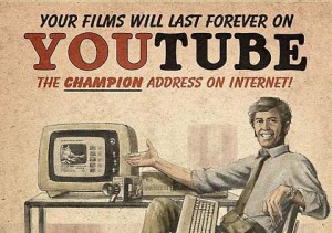
New technology, vintage ads
Vintage style poster advertising meets social networks and emerging technologies. I love this project by Lost at E Minor where illustrators created a series of vintage ads for Kindle, Facebook, Youtube and Segway. What I like in particular is the idea that it really feels like these products & services have been with us forever.
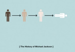
Lives of celebrities in pictograms
If I have to name one reason why I love infographics & pictograms it will be the envy for the capabilities of visually recapping concepts with beautiful and straightforward combination of text and and images. More than the content itself I would say I’m fascinated by the form. So I guess there is really no wonder why I love these geeky pictogram illustrating the lives of celebrities like Michael Jackson, Marie Antoinette, Bruce Lee etc… Read more…
Solen Crazy Balloon Gum #Print
I love a good visual print ad and these ones from Solen Crazy Balloon Gum are nice.
Social media propaganda
Fantastic work by Aaron Wood who created a series of WWII propaganda style posters inspired to Twitter, Google+ and Facebook.
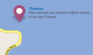
Don’t drive and check-in
I love this print campaign by Top Gear that promotes road safety using a social media friendly approach. For once I feel that even if it doesn’t use shocking images it still speaks a language that connects with anybody from 16 to 45 (at least).
Popular posts
Tags
adidas advergame advergames advertainment advertising ambient marketing australia belgium best brazil coca-cola email marketing facebook fashion france germany google heineken ikea infographic italy japan marketing mobile content mobile marketing msn nike nokia online ads online advertising online campaign online marketing print advertising rich media samsung sms spain sweden tvc twitter uk video of the day viral marketing volkswagen wieden + kennedy

